
It’s back! Probably ‘the’ most beautiful book ever created and dedicated entirely to the jersey fans favourite element – the typography. Face37 release the second in their award winning book series – Football Type 2. And as you’ve probably realised – we really, really like it.
Football Type 2 is the sequel and revised edition to the award winning book Football Type — a book celebrating the history of football and typography. It’s the brain child of Face37’s studio leads, Rick and Annabel Banks. The Manchester based studio is an award winning graphic design studio, servicing a global roster of clients. The studio has helped create some of the world’s most loved brands, including: EE, Triumph Motorcycles, MLS, and British Heart Foundation.
Specialising in brand, book and type design, their work has won numerous awards, including a yellow pencil from D&AD and a TDC from the Type Directors Club in Tokyo. Not to mention featured in the likes of the Creative Review Annual and receiving high praise from the Creative Circle, Communication Arts, TDC (NY) and ISTD.
To say Face37 have achieved rather a lot is an understatement. But we’ll stop giving our crush away on the studio and it’s exploits now. Did we mention their work has been exhibited in the London Design Museum and Ginza Graphic Gallery in Tokyo?!
Anyway – we caught up with Rick to talk about the studio’s latest book release, 'Football Type 2' and find out a bit about the process and the stories unearthed behind the type faces included.

RB: I'm a Bolton Wanderers fan.
CK: You released the first Football Type book back in 2013 – how have you seen shirt typography evolve since then?
RB: Yes. I’d like to think that the first book helped bring a focus on a really interesting area for typography. I’ve seen more brands, clubs and football associations employ and invest in good design agencies and type designers which can only be a good thing. Last year we were lucky enough to be commissioned to design the lettering for the MLS which was a dream job for us.

CK: What is it about football lettering that captures your interest so much?
RB: It was my first insight into typography as a young boy. I remember trying to copy the lettering from football shirts in the back of my school books, fuelling my passion to progress a career in design from an early age.
CK: The book delves into the stories behind the numbers – was the information easy to come by?
RB: Yes. The writer, Denis Hurley, runs the blog squadnumbers.com so all his incredible knowledge floods throughout the book. He was perfect for the project.

CK: Did any of the stories behind the type surprise you at all?
RB: Yes, there are lot. Here are few from the book:
The bold and graphic lettering designed by Mart Anderson for the Estonian FA is superb. Based on the Estonian tradition of stone-carving, the angular shapes look simple but are in fact based on a strict system of rake angles — each adjacent letter fits together in a mosaic-like fashion to form a complete pattern.
From the moment Zinedine Zidane swung his boot at the ball to volley Real Madrid to victory against Bayer Leverkusen to secure a ninth European title in 2002, thoughts turned to La Décima or a tenth. For 2007-08, Sporting iD created a font based around this quest, with the ten-sided decagon shape forming the basis for the numbers.

In terms of actual squad numbers stories, goalkeeper Carlos Roa’s 1.3 is super interesting. Spanish league rules mandated that goalkeepers had to wear № 1, 13 or 25 and Roa had opted for the middle one of these options, placing a dot between the ‘1’ and ‘3’ — a member of the Seventh-day Adventist Church, he was paying tribute to the Holy Trinity and his belief in the existence of God, Jesus and the Holy Spirit in one.

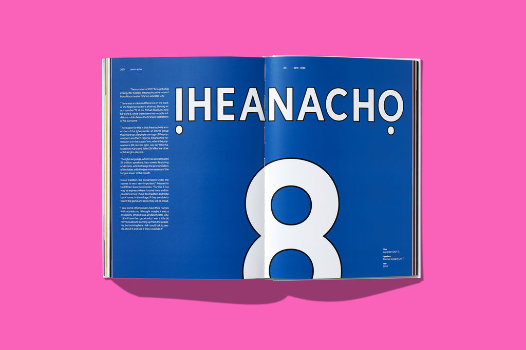
The dots under Kelechi Iheancho’s surname was super interesting too. Having worn number 72 at the Etihad Stadium, now he wore 8, while there were two notable additions dots below the first and last letters of his surname. The reason for this is that Iheanacho is a member of the Igbo people, an ethnic group that make up a large percentage of the population in southern Nigeria. Iheanacho’s hometown is in the state of Imo, where the population is 98 percent Igbo. The Igbo language, which has an estimated 24 million speakers, has vowels featuring under-dots, which change the pronunciation of the letter, with the jaw more open and the tongue lower in the mouth.
CK: If you had to choose an era of football type as your standout – which would it be?
RB: From a nostalgic point of view I loved the NFL/NBA lettering era of the Premier League in 1993. Schmeichel’s 1993 Man Utd shirt was the first jersey my mum bought me.
From a design point of view I love the 70-80s era. For Football Type 2, we found even more beautiful and quirky lettering from this era, especially from the North American Soccer League (NASL).

CK: How do you see football lettering evolve over the next, say 5-10 years? Do you think they could take on more of an interactive/digital function?
RB: I don’t think so. At the end of the day name and numbers are there for identifying players. Yes they should be beautiful but they should be super functional too.
Every year, millions are spent on football shirt design. Clubs and manufacturers are ditching the off-the-shelf fonts and investing in beautifully designed, custom-made typefaces
to match the kit and even the whole campaign. In 2012, GBH Design designed the typeface ‘Gaffer’ for PUMA. This look wasn’t just for shirts; it was a whole campaign. It appeared on merchandise, footballs, boots and even featured in football video games like FIFA. I’d like to think brands will think more holistically like this.
We might also see more uniform approaches like La Liga where they followed the lead of the Premier League with a rule that mandated teams to use the same font for domestic league games.
CK: Can we expect to see a Football Type 3?
RB: I always say to myself ‘I will never do another book’ after publication due to the back breaking work of getting them all sent out.
Never say never.


CK: If people want to buy the book, where can they get their hands on it?
RB: It's available to purchase from our website: face37.com/shop
CK: Can you tell us a bit about what's next in terms of projects for your studio?
RB: We have two custom fonts coming out soon, one for a global ice cream manufacturer and one for a major appliance retailer. We also have a few potential music projects in the pipeline.
_
You can find out more about Face37 studio's work here.