
With the launch of new shirts coming thick and fast, it's hard to keep up with them all. But there's been a few that have caught the eye, for a number of reasons. The colours, the brand's new tech and of course, the badge revamp. One such club to have taken a look at their badge is Grimsby Town F.C. and we caught up with the designer behind it.
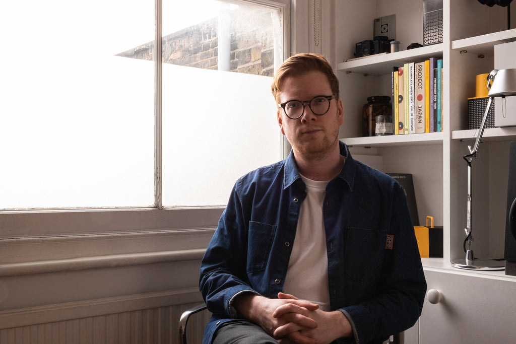
The designer is long time Grimsby fan, Rich Lyons. Currently a designer for Apple, Rich. Who, back in 2022 got involved on the club's Crest re design. Fans can often assume a club's beloved badge, (or crest) should remain untouched. And we're not saying they're wrong. But not many understand the reasons, nor the process for a more often than not, much needed update/modernisation.
We caught up with him to hear more about the designer, the project and its process.
CK: Who do you support?
RL: I’m a lifelong Grimsby Town supporter, and as with a large majority of kids that I grew up with in the 80s and 90s, I also follow Manchester United.
CK: Tell us a bit about yourself
RL: I live in Clapton, London, and work as a designer for the Apple Design Team. I lived out in San Francisco for almost five years while working on that team, and moved back here around two years ago. I guess I missed going to watch football too much!
CK: What's your earliest memory of getting into football
RL: In the early nineties, Sunday afternoons in the pub with my Dad weren’t particularly thrilling for a kid of around 10, but I was obsessed with collecting these Serie A team beer mats they had laying around. Wish I still had them now. My favourite memory is witnessing my dad wildly celebrating David Seaman saving Gary McAllister's penalty while watching Euro 96 on telly. I don’t think I really appreciated how football affected people emotionally until that exact moment.
CK: Do you have a favourite football shirt?
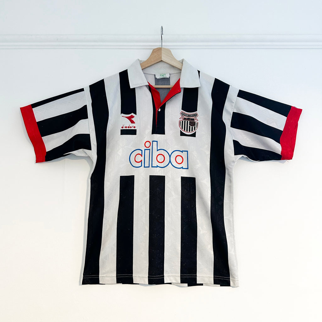
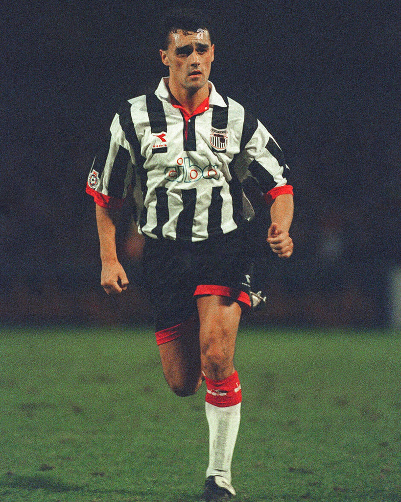
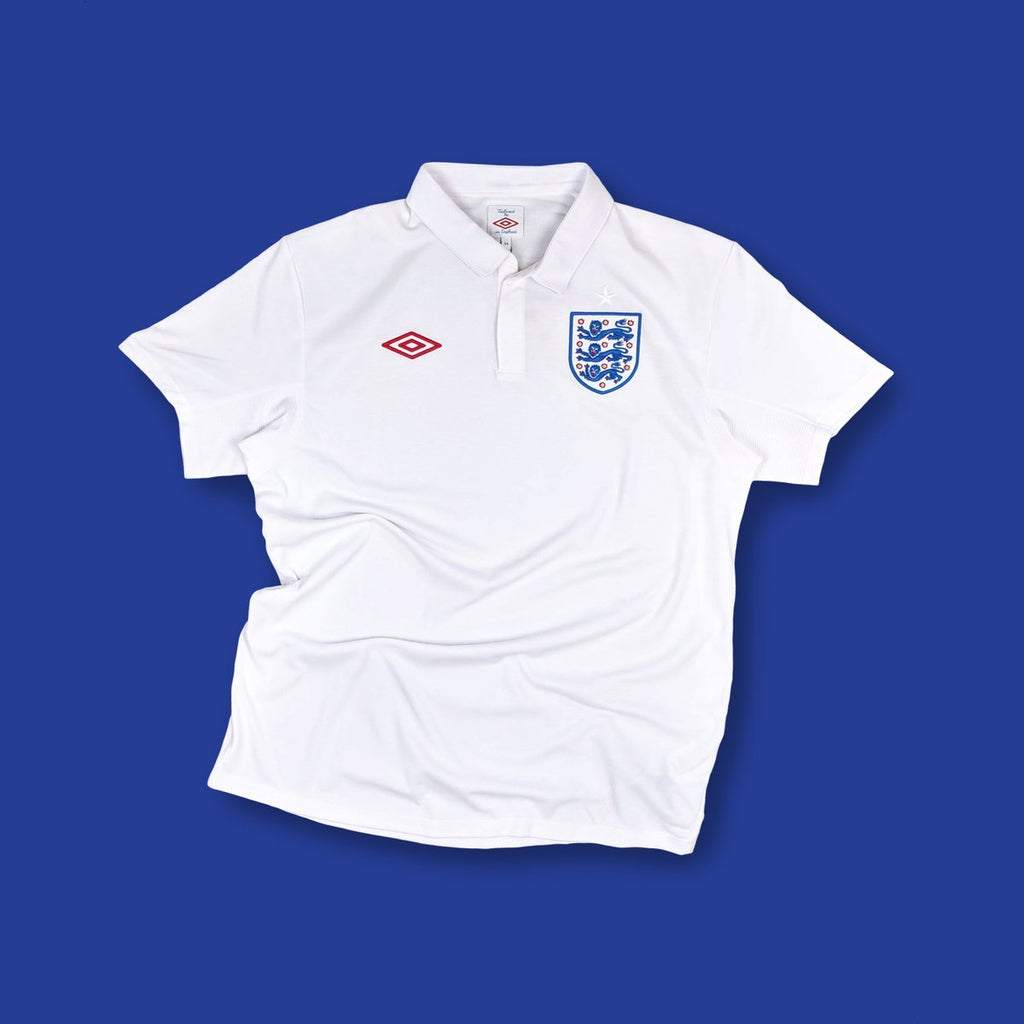
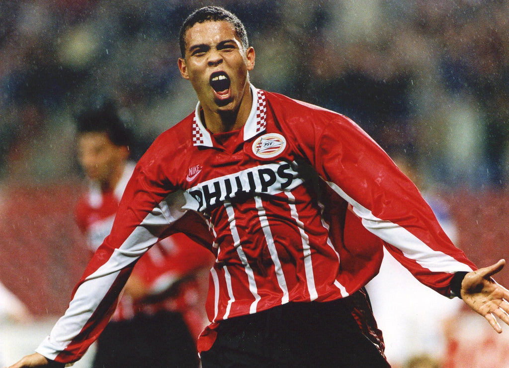
RL: Impossible to choose one! My favourite Grimsby shirt ever is the 94/95 Home by Diadora – button collar, perfect stripe width, excellent sponsor logo, and just the right amount of red accents. Aside from Grimsby, the 2010 Tailored by Umbro England kits are perfection to me – the minimal designs, the quality materials – timeless. Honourable mention to the incredible 95/96 PSV Home shirt by Nike, that would get my pick most days of the week.
"Predictably, there was some backlash – club crests are precious things that many fans don’t like being changed."
CK: Tell us a bit about your recent work with Grimsby Town
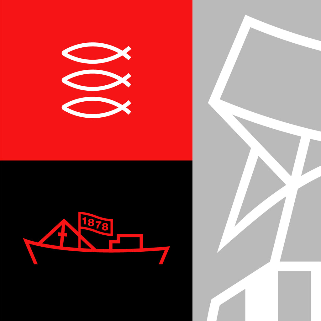
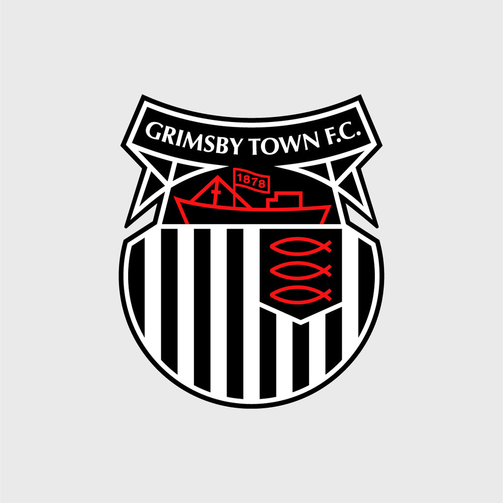
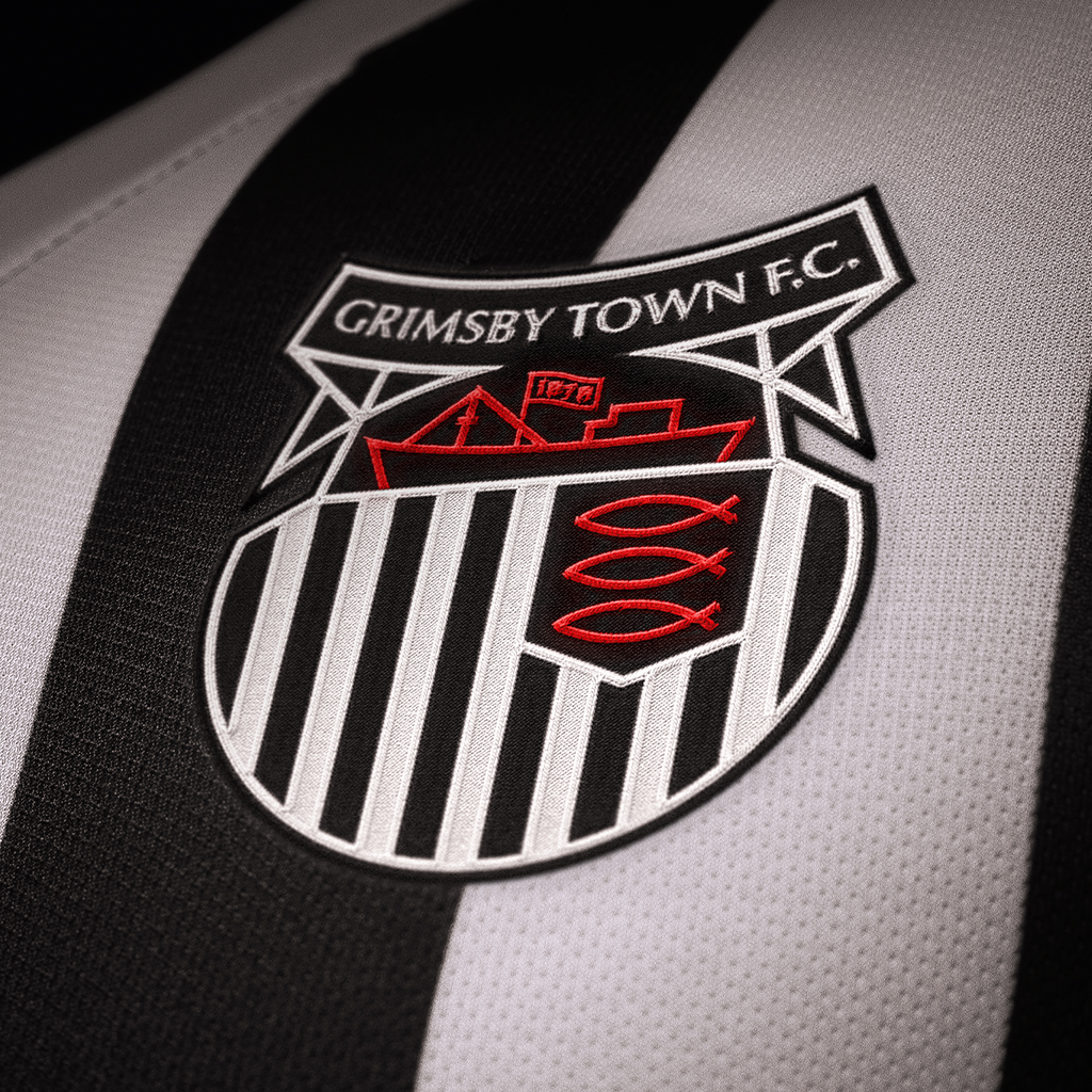
RL: At the beginning of 2022, the club launched a redesign of their club crest, which I designed. It’s not wildly different to the previous one, but I thought it could do with a respectful modernisation. The previous crest had never been professionally drawn digitally, and suffered lots of inconsistencies due to being reproduced so often. The new design is constructed entirely on a geometric grid, and I added the club’s founding year, as I thought this was really important for such an historic club. Leading up to the launch, I also helped advise the club on some design updates to their website.
CK: How did the work come about?
RL: While still living in San Francisco, about three years before the crest was launched, I decided on a whim to start tinkering with the previous badge. It was a really slow process because I couldn’t commit the time I wanted to it, particularly since it wasn’t actually being commissioned, and I had a full-time job. Around a year later, when the Covid-19 pandemic lockdowns were in place, I decided to pick it back up.
"It hit me that I was changing something really historic, but thankfully got through it, and I’ve already seen someone has it tattooed, which is usually a good sign!"
That coincided with the club being taken over by new owners – everything they were saying and doing seemed really progressive, and led me to think it could be worth a shot asking if they would consider the update. I put together a proposal outlining what didn’t work about the previous crest, and the potential of the new one. I had a lot of fun creating some mockups of how the badge could look in various scenarios! Luckily, the new owners were really into it, and that got the ball rolling.
CK: What has the reaction been?
RL: Generally, really positive. Predictably, there was some backlash – club crests are precious things that many fans don’t like being changed. There was some controversy around the launch about the club not consulting fans beforehand, which resulted in a post-launch democratic vote for or against the new badge. Thankfully, my version was favoured. I did have a mild wobble around a month before the launch – I was visiting my Dad’s gravestone, and, while walking around the cemetery, saw quite a few headstones that had older versions of the Grimsby Town crest on them. It hit me that I was changing something really historic, but thankfully got through it, and I’ve already seen someone has it tattooed, which is usually a good sign!
CK: If you could work with another team, which club, (or international team) would that be and why?
RL: Purely on a sentimental and scale level, working with Manchester United on kits and branding would be incredible. But a dream job would be to work on an entire range of World Cup kits, preferably for Nike.
CK: What plans (design wise) do you have for the future and where can people find your work?
RL: I’ll continue working for Apple – our team’s work is seen and used by billions of people, which takes some beating! Nearly everything you see on the screen of an Apple device is done by our team. In an alternative world, I’d love to work on more badge and kit designs. I’ve always found it odd that there’s not a dedicated design studio out there that works purely on team kits and graphics, that I know of. Maybe I should start one. I don’t have much work online, but anything I post will be on Instagram/Twitter: @richlyons_ or my website: richlyons.co
7 comments
Amazing work! I’m a huge fan. x
I like the new badge but would be interested in seeing what he could do with the early badge where the dock tower was prominent. That for me is the iconic Town badge, shame it appears to have been forgotten about overtime. But I like your work
Well done lad think most have come round .Nice to see year we were born on the crest utm
Well done lad think most have come round .Nice to see year we were born on the crest utm
If it had to change, good to see it was changed by a former local lad and town fan. Well done Rich.
Leave a comment